A showcase of innovative product design.
Management Console
Redesigning an enterprise platform used by internal teams and third-party wellness providers

Overview
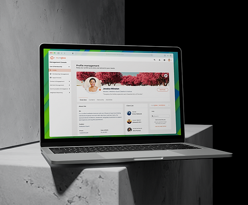
At RoundGlass, I led the redesign of a core enterprise platform used by both internal staff and third-party providers. This Management Console served as the operational backbone for scheduling, profile management, and content delivery across the company’s wellness ecosystem. The original experience was functional but fragmented, prioritizing internal “expert” users at the expense of usability and efficiency. My goal was to create a more intuitive, scalable interface that supported a range of user types and experience levels.
Problem Statement
The existing console overwhelmed users with a cluttered interface and lacked clear pathways for core tasks. Third-party providers struggled to locate or update key content, while internal admins found service scheduling and profile approvals confusing and inefficient. The tool lacked meaningful hierarchy and surfaced the wrong features at the wrong time, leading to repeated support escalations and a fractured user experience.
Users & Audience
-
Internal Admins & Project Managers
Responsible for onboarding providers, managing schedules, verifying content, and processing payouts.
-
External Wellness Providers
A diverse group—including meditation coaches, yoga instructors, nutritionists, and musicians—tasked with maintaining availability, running sessions, and managing personal content.
Each group had different goals, workflows, and levels of technical fluency. The redesign had to support role-based access without fragmenting the system or duplicating interface logic.
Role & Responsibilities
I served as the primary Product Designer for this initiative, leading UX strategy, information architecture, and end-to-end UI design. I collaborated closely with product managers and engineers throughout the redesign and delivery process. After launch, I worked with two additional designers to adapt the experience for mobile within the company’s responsive design system.

Approach & Implementation
A six-month design effort, from research through release
Scope & Constraints
The project was originally scoped for 4 months but extended to nearly 6 due to evolving priorities from executive stakeholders. The redesign had to operate within existing backend structures with minimal engineering capacity for refactoring. I also had to balance internal aesthetics goals with usability needs, advocate for user-informed tradeoffs, and navigate competing priorities from multiple departments.


Discovery & Definition
I began with a structured discovery phase, conducting interviews with both admins and external providers, reviewing support tickets, and analyzing workflow bottlenecks.
Key user insights:
-
Many providers had stopped using parts of the console altogether due to confusion and uncertainty.
-
Simple tasks like updating availability or bios required support intervention.
-
One provider kept a written schedule on paper, unsure if changes in the console were saving.
-
Several users had created informal workarounds, including direct support contact and offline tracking.
These behaviors revealed not just usability issues, but a broader lack of trust in the system’s reliability.
I also performed a competitive audit of admin/provider tools to gather best practices around navigation models, contextual help, and guided task flows.
Design Strategy & Early Concepts
The design strategy focused on clarity, prioritization, and trust.
Key approaches included:
-
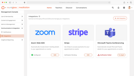
Rebuilding navigation into clean, task-oriented categories
-
Introducing contextual breadcrumbs and collapsible flyout menus
-
Structuring screens around high-frequency actions with minimal cognitive load
Early wireframes emphasized:
-
Logical grouping of tools
-
Inline editability with clear affordances
-
Progressive disclosure to manage task complexity
A critical decision was to consolidate the session scheduling flow into a unified dashboard. Prior to redesign, scheduling was spread across multiple screens with no clear relationship. Users frequently made changes, then contacted support to verify they’d saved correctly. The new design offered real-time visibility into availability, sessions, and conflicts—all in one place.


Prototyping & Feedback
I created interactive Figma prototypes covering the full range of provider and admin tasks, including scheduling, navigation, and profile editing.
Feedback sessions included:
-
Live walkthroughs with internal stakeholders
-
Asynchronous testing with external providers using recorded demos and guided prompts
Findings and follow-ups:
-
Users often didn’t realize profile rows were editable. I added hover states, subtle icons, and spacing tweaks to make editability more obvious.
-
Support contacts dropped as users began trusting inline confirmation, visual indicators, and status cues.
-
Overall feedback showed the tool felt “more like a real platform” instead of a back-office workaround.
Design Advocacy & Tradeoffs
There were points where stakeholder priorities leaned heavily toward visual polish. In some cases, proposed UI elements looked clean but confused users during testing. I reframed these as opportunities for alignment—offering variations that preserved visual intent while improving interaction clarity.
In one instance, we couldn’t implement fully dynamic scheduling due to backend limitations. I worked with engineering to define preset availability patterns with override options—simplifying the interface while restoring core control for providers.
These tradeoffs helped maintain design momentum without compromising user trust.
Results
Internally, the redesigned console was seen as a benchmark for future tooling—praised for its clarity and task-oriented structure.
"It finally feels like part of the same product."
-Wellness Provider
"I like that I can actually update my schedule without contacting support."
-Meditation Expert & Social Media Influencer
"It used to take forever to make simple changes [to the profile], so I’d just leave things outdated. The new layout makes a lot more sense, and the design feels fresh."
-Holistic Nutrition Expert

Quantitative Impact
To evaluate success, I partnered with our PM and support team to review Hotjar heatmaps, feedback widgets, and onboarding behavior. Together, we tracked post-launch trends and support summaries, focusing on both adoption and ease of use.

-
~28% drop in provider-related support tickets within two months of launch
-
~73% of providers completed onboarding or profile edits without admin help, up from ~49% before
-
~62% increase in engagement with previously underused features like profile editing and scheduling
-
Shift in behavior
More providers migrated off personal blogs or third-party tools and began managing their offerings directly through the RoundGlass App, reinforcing it as a central hub
Looking Ahead
One area I wanted to improve further was the first-time experience. Onboarding remained a challenge, especially for less technical providers. After launching this iteration of the console, we began a separate project focused on onboarding—evaluating guided flows, embedded prompts, and structured support handoff.
The redesign laid the groundwork, but onboarding needed dedicated attention to ensure the entire lifecycle—from setup to day-to-day usage—was equally intuitive.
Personal Learnings
This project deepened my ability to:
-
Navigate executive-level changes without derailing design momentum
-
Ground visual decisions in real user behavior
-
Frame user advocacy as strategic alignment, not resistance
-
Deliver clarity and confidence to users—especially when system trust has been eroded
If I could go back, I’d push earlier for defined success metrics tied to user experience—and invest in building a lightweight, recurring feedback loop post-launch to catch issues before they became support patterns.


