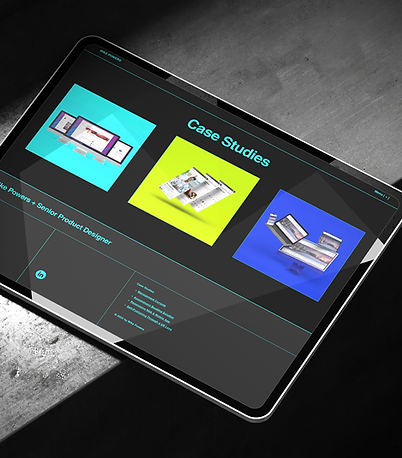
A showcase of innovative product design.
Designing a Moderation Platform from the Ground Up
An internal tool for scalable, flexible content review in a live game ecosystem

Success Snapshot
As the sole product designer on this ground-up internal tooling project, I delivered a fully functional MVP in under six months—supporting end-to-end moderation workflows across triage, petitions, and audit tracking. The project gave the pod significant visibility, leading to a new adjacent initiative. My design work seeded components later adopted into the org’s design system, and the platform was demoed across multiple internal teams exploring similar solutions.
Due to NDA restrictions, this case study features conceptual work created independently for illustrative purposes. While the study reflects the actual process and workflow I followed, all product names, logos, UI designs, and branding—including color choices—were reimagined solely for this presentation and do not reflect proprietary assets of the company I worked for.
Overview
I was asked to design a new internal moderation tool from scratch—one that could replace third-party platforms and support how our teams reviewed reports, handled petitions, and tracked audits. The existing tools were too rigid and didn’t account for the way moderation worked in live service games. The new system had to be flexible enough to support different team structures and pipelines, with features for review, analytics, and compliance. There was no existing framework—just a general goal, a few key workflows, and the expectation that I’d define the rest.
Problem Statement
Moderation teams were relying on third-party platforms that didn’t fit the realities of how they worked—rigid structures, limited visibility, and no support for appeals, cross-case patterns, or nuanced audit tracking. We needed something internal, something built around real workflows instead of generic assumptions. The immediate goal was to support two specific game teams, but long term, this was meant to prove out a flexible, modular system that other teams could adopt and evolve for their own needs.
Users & Audience
The primary users were content moderators—teams responsible for reviewing player-submitted reports, evaluating evidence, applying penalties, and responding to petitions. They needed tools that supported deep case history, multiple evidence types, and clear visibility into past actions.
Secondary users included Trust & Safety leads, team managers, and policy reviewers. These users needed higher-level visibility into trends, edge cases, and player escalations. Platform admins and compliance stakeholders also played a role, needing audit trails and data governance aligned with policy and legal standards.
The challenge was to design a system that served hands-on moderators without overwhelming them, while also surfacing the right data for leads and meeting the expectations of compliance teams looking for accuracy, transparency, and traceability.

Roles
I was the sole Product Designer, responsible for every aspect of design—from early product flows and wireframes to high-fidelity UI, prototypes, and final engineering handoff. This included designing end-to-end UX for each feature, iterating based on feedback, and delivering production-ready visuals.
Responsibilities
Working fully remotely, I collaborated closely with a PM and Technical Director based in Vancouver, as well as a lead engineer in Montreal. I participated in sprint planning, retros, demos, and async reviews throughout the product lifecycle.
Early stakeholder demos were based on my interactive Figma prototypes, then transitioned to a combination of prototypes and working staging environments. While the PM led demo sessions, I worked closely with them to digest feedback and prioritize design changes.
Beyond the product itself, I created the internal branding and theming system for the platform. I developed a themeable, scalable UI kit in Figma that supported modular growth and cross-team reuse. That work laid the foundation for broader design system adoption, and I partnered with engineers to create reusable components in Storybook that matched the visual and interaction specs.
Scope & Constraints
The tool was initially scoped for two specific game teams, but designed from the start to scale across other orgs. There was no internal precedent and no legacy tooling to build from—we were starting from scratch.
We had roughly six months to design, build, and ship the MVP, all while navigating cross-team coordination and shifting priorities. Midway through the project, one of the original teams was restructured and the tool was deprioritized. Even so, we delivered a stable, fully functional build—on time and built to extend.
Research was also limited. Most third-party moderation tools required paid access, so I couldn’t rely on traditional competitive analysis. Instead, I used internal documents, stakeholder feedback, screenshots, and product intuition to define the structure and workflows.
Inside the Build
No templates. No legacy tools. Just systems thinking, stakeholder alignment, and a modular foundation that scaled.
Discovery & Requirements Gathering
With no internal tooling to reference, I met with PMs, engineers, and moderation leads to identify the most pressing workflows to support: report triage, petition handling, evidence review, and audit history. I couldn’t conduct deep comparative research due to licensing barriers, so I relied on stakeholder interviews, third-party screenshots, and internal documents to model likely feature needs.
We aligned on a flexible architecture that could grow over time, and I used that to generate early feature matrices and documentation for core flows.


Journey Mapping & Early Flows
Together with our Technical Director, we mapped out the full case lifecycle, including report intake, moderator action, appeal handling, and closure. I created role-based flowcharts for moderators, leads, and admins to ensure clarity and reduce unnecessary overlap or friction.
An early design featured thumbnail previews of flagged images, which were later dropped due to asset limitations—we only had full-resolution images and no dev bandwidth to generate thumbs. I adjusted the design to better accommodate larger image handling without cluttering the UI or harming performance.
Wireframes & Modular Architecture
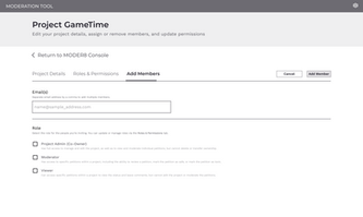
I wireframed individual units—like evidence panels, audit trails, case status cards, and comment threads—as modular components. These were designed to be rearranged, toggled, or themed depending on the team’s needs.
The modular structure allowed engineers to build in parallel and gave future teams a foundation they could adapt without starting from scratch.


Without other designers to bounce ideas off, I had to be extra deliberate in documenting decisions and seeking early feedback from PMs and engineers.
Prototyping
I built interactive Figma prototypes for key flows, which we used in early stakeholder demos. As engineering brought staging environments online, we began combining live previews with Figma flows during review sessions. I coordinated closely with the PM to incorporate feedback and refine designs between sprints.
Stakeholder Feedback
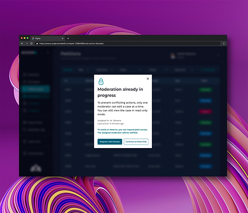
Moderation leads flagged several usability issues early—too many clicks to reach related cases, difficulty tracking decision timelines, and confusion when multiple moderators opened the same item at once. Only one action would be accepted, and others wouldn’t see the conflict until they tried to submit. That led to wasted effort and inconsistent outcomes.
To fix this, I worked with engineering to implement a locking system with a visible in-progress indicator. When a moderator opened an item, it was marked as active. Others could still view it, but they’d see that it was already being handled. This reduced overlap, avoided conflicting actions, and made the workflow easier to trust.


Visual Design, UI Kit, and Design System Integration
The components designed for the moderation tool became the first building blocks of the parent organization’s Design System. Created in Figma, the kit was fully themeable, accessible, and built for reuse across multiple internal tools and pods. Once UX was validated, I partnered with engineers in Storybook to build live components that matched the visual and interaction specs.
Self-Care Support
Recognizing the emotional toll of moderation work, I proposed and designed a self-care module—something that wasn’t part of the original scope. No one asked for it, but I saw the need early and made the case for including it. The “Self Care” section was added to the documentation, accessible via the side navigation, and offered guidance on stress management, boundary-setting, and mental wellness. Leadership backed it as part of the planned v2 experience, and it became a valued support resource for the team.

Outcomes & Lessons Learned
Impact & Adoption
Despite a strategic pivot by the game team, the moderation platform delivered meaningful wins across the org.
-
Shipped a stable, fully functional MVP in under six months, supporting core workflows like report triage, petition handling, audit trails, and admin controls
-
Game team users responded positively to the UI, citing easier navigation, clearer content visibility, and overall improved usability
-
Internally demoed as a model for scalable moderation tooling, helping the pod secure a follow-on project with greater visibility and priority
-
UI kit and system patterns were adopted into the broader design system, reused across other teams even after the tool was deprioritized
-
The platform’s design influence persisted across internal tools, outlasting the original scope and stakeholders
As a loaned designer, I moved on after MVP delivery—but the design patterns and component library remained in active use, informing future internal tools across the org.


Reflections & Moving Forward
Moderation is complex work. The workflows are messy, the stakes are high, and the decisions aren’t always clear-cut. Designing for that meant navigating legal ambiguity, technical constraints, and the emotional demands placed on moderators. It required structure, flexibility, and systems that could hold up under pressure.
The product went live and immediately informed how teams approached future moderation workflows. It strengthened the design system, clarified patterns for high-risk decision flows, and helped set a foundation for tools that came after it. For me, it reinforced the value of designing for edge cases, of advocating for the people doing the work, and of building systems that support more than the screen in front of them.


